Colour notebook · 3 min read
The Ultimate Guide to Farrow & Ball Swatches for UK Living Rooms
Compare Hague Blue and Ammonite, assess changing daylight and test real samples before decorating your living room.
By the RoomAI Studio editorial team
Begin with the room, not the colour chart
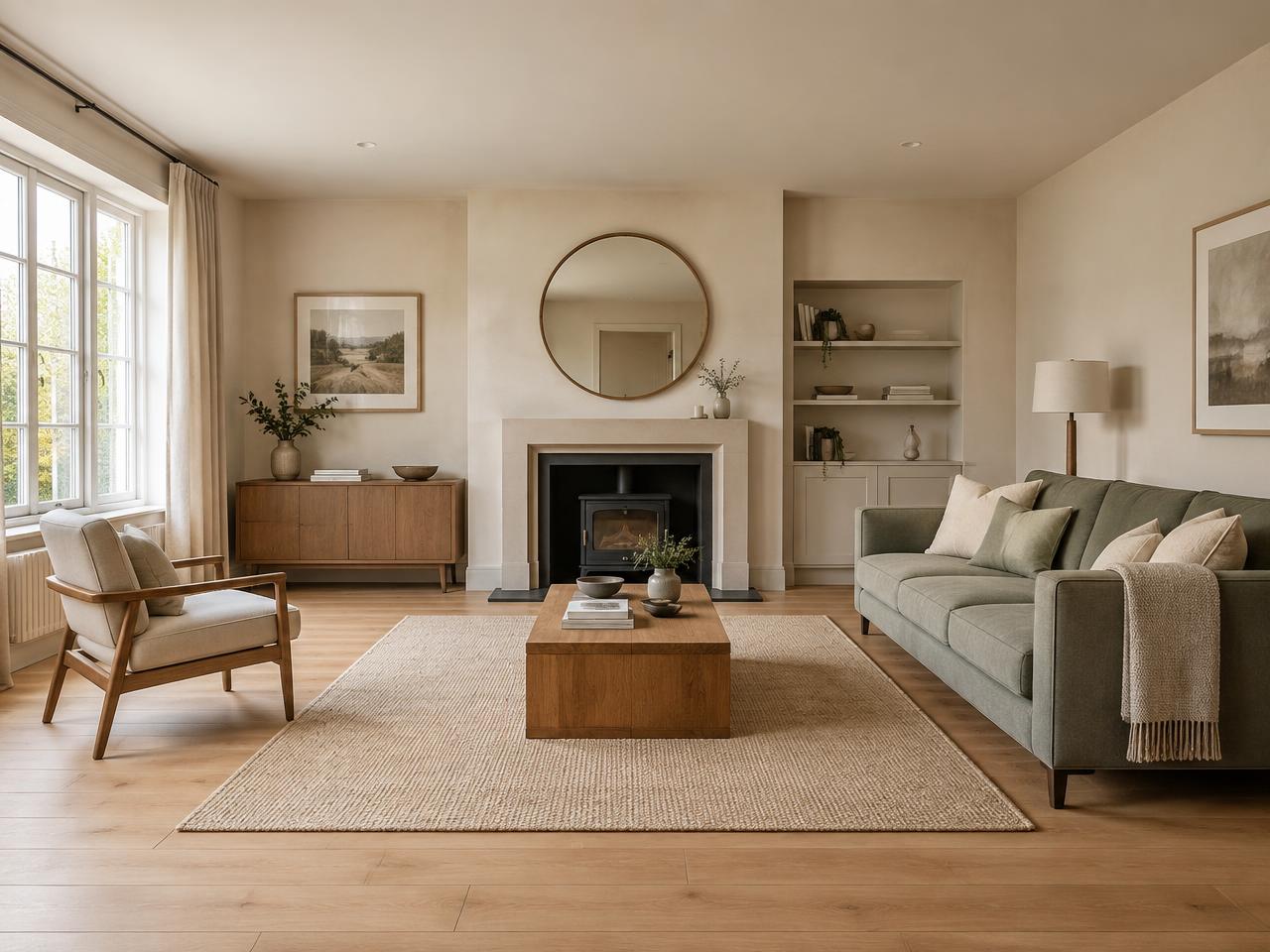
Choosing a living-room colour is a decision about light, surfaces and everyday life, not simply a favourite square on a screen. A shade that looks restful in a bright showroom can feel quite different beside a shaded bay window. Before comparing Farrow & Ball swatches, note when you use the room, which direction its windows face and whether neighbouring buildings interrupt the daylight. Your evening lighting matters just as much if the room is mainly used after work.
Keep the elements you will not replace in view: flooring, a fireplace surround, sofa fabric and curtains. Collect these references together rather than judging paint against a blank white background. The aim is a palette that belongs to your home, not a perfect copy of an editorial photograph. RoomAI Studio can help compare broad colour directions, but a generated picture cannot establish how physical paint will behave on your walls.
Hague Blue: depth with green undertones
Farrow & Ball describes Hague Blue as a deep blue with green undertones. It is a useful candidate when you want the walls to contribute character rather than disappear. In a living room, compare it beside timber, pale upholstery and existing metal finishes. A strong contrast with light trim creates a different impression from taking a similar dark colour across woodwork; neither approach is automatically right for a small room.
In a north-facing or heavily shaded room, do not assume that a pale paint is the only solution. A deeper shade can make a deliberate, enveloping backdrop, especially when lamps illuminate seating and reading areas. Nevertheless, test Hague Blue in the darkest corner as well as near the window. An image taken on a bright afternoon is not a reliable forecast of the whole room on a winter evening.
Ammonite: a quieter starting point
Ammonite is described by Farrow & Ball as an understated grey, neither too warm nor too cool. That makes it a useful comparison against Hague Blue when you want furniture, art or textiles to carry more of the visual interest. Its restrained appearance does not mean it will look identical everywhere: surrounding colours, shadows and the finish you choose still influence what you see.
South-facing rooms often receive stronger daylight, while east- and west-facing rooms change noticeably over the day. Compare Ammonite during the hours that matter to your household. Place it next to a warm carpet and then a cooler hard floor to see how the relationship changes. Avoid committing on the strength of a phone photograph, which may automatically adjust exposure and white balance.
A sampling routine that earns its keep
Follow the manufacturer’s sampling instructions and use large movable samples so you can compare several positions. Farrow & Ball recommends applying two coats to sample paper or card. Move each sample between the window wall, the fireplace and the seating area. Look in daylight and under your usual lamps, and leave the samples in place long enough to encounter ordinary weather rather than one unusually sunny day.
Digital swatches, including those in RoomAI Studio, are screen approximations rather than certified colour measurements. Display brightness, the original room photograph and AI processing can all change the result. Check the manufacturer’s current shade name, finish, coverage and preparation instructions before buying. Compare retailer offers for the same tin size and finish, then confirm the checkout price and delivery charge. A small investment in physical samples is usually more useful than treating any digital preview as a guarantee.