Colour notebook · 3 min read
A Complete Guide to Farrow & Ball’s Hague Blue vs Dulux Alternatives
How to compare Hague Blue with Dulux blues fairly, without assuming that any alternative is an exact colour match.
By the RoomAI Studio editorial team
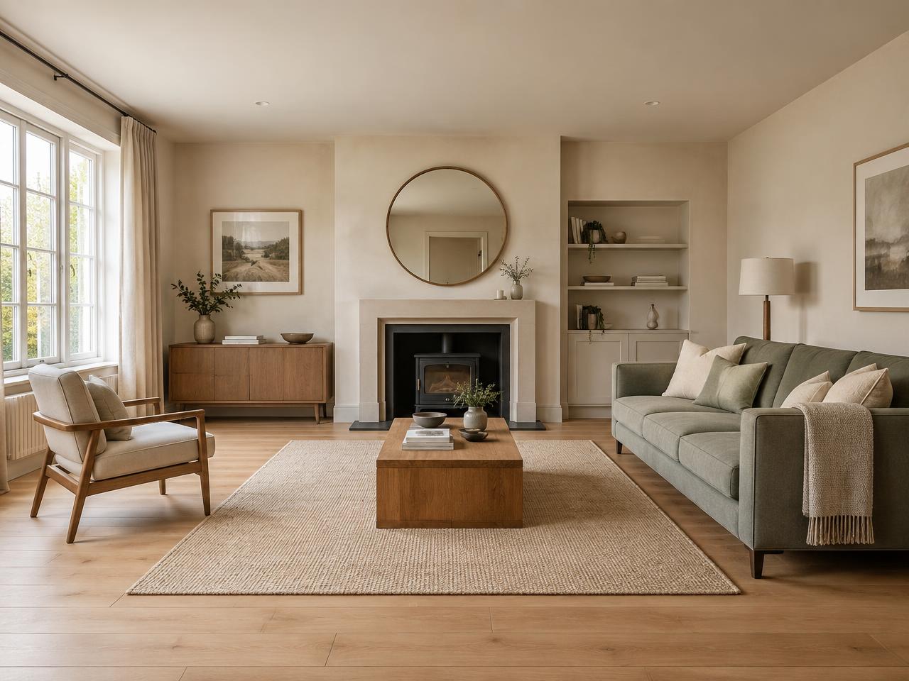
What Hague Blue is
Farrow & Ball describes Hague Blue No. 30 as a deep, dark blue with green undertones. That undertone matters: beside warm timber it can feel enveloping, while beside cool white woodwork the green-blue quality may appear crisper. It is a shade to evaluate in context rather than from a small screen swatch.
Why “dupes” are risky
Paint colours are made with different formulations, finishes and pigments. Two colours can look close in one photograph and diverge on a wall. Dulux publishes its own blues, including names such as Sapphire Salute and Denim Drift, but its listings do not establish either as a match for Hague Blue. Treat any alternative as a candidate for comparison.
- Do not rely on hex values or phone photographs as proof of a match.
- Compare the same sheen level where possible.
- Check current manufacturer information for each colour and range.
- View samples in the room where the paint will be used.
A fair side-by-side test
Use a repeatable routine so neither colour gets an unfair advantage.
Prepare large samples
Paint sample boards or card following each manufacturer’s instructions. Label the backs so you can judge without bias.
Move them around
Place samples beside the window, in a shaded corner and next to fixed materials such as flooring and a fireplace.
Check at several times
Look in morning daylight, late afternoon and under your usual evening lamps. Record which looks more green, grey or violet in each position.
Questions that decide the winner
The better choice is the colour that suits your room, budget and finish, not the one that wins an online comparison.
- Does the undertone suit the floor and furniture?
- Is the depth comfortable in the darkest part of the room?
- Which finish suits the wall condition and how the room is used?
- What is the total cost for the coverage you need, including primer?
- Is the chosen product available in the size and finish required?
Comparing cost properly
Price per tin is only one part of the calculation. Compare tin size, recommended coats, coverage, finish and delivery. A cheaper paint that needs extra coats in your situation may narrow the difference; a premium paint is not automatically right for every surface.
RoomAI Studio swatches are screen approximations. They help you shortlist broad colour directions, then physical samples and manufacturer specifications should guide the purchase. Confirm final prices with the retailer at checkout.
For a simple coverage exercise, measure wall widths and heights, then follow the product’s guidance on deductions, coats and spreading rate. Do not assume that two ranges cover the same area per litre. Make the comparison for the complete room, including any separate woodwork paint, rather than comparing a sample pot with a full decorating purchase.
A north-facing lounge comparison
Imagine a shaded lounge with an oak floor and a pale sofa. Place Hague Blue beside the candidate Dulux sample on the same board size. First judge how each relates to the oak; then move them behind the sofa. A blue that seems suitably deep by the window may lose the distinction you wanted in the back corner. Conversely, a lighter alternative may feel less enveloping than your original brief.
Write down what you prefer rather than trying to declare a universal winner. If one colour suits daylight and another suits your lamps, consider which hours you actually use the room. Keep the sample visible during ordinary weather before making the final choice.